5 Tips for Cinematic Formatting
March 20, 2023
In my article 5 Tips To Making Your Screenplay Look Professional, I wrote about how in an extremely competitive marketplace it's important for screenwriters to make their scripts look as professional as possible. In addition to having your screenplay look professional, however, it's also important for it to read cinematically. And by this I mean your script should have the visual and aesthetic impact of a feature film (or a more cinematic cable or streaming series).
Ideally, you want the reader to be visualizing what you're visualizing in your head, and most importantly, thinking of it as something they can easily imagine on the screen. The more cinematic the imagery and overall presentation, the more a reader will consider the script a project that can be produced.
Below are 5 tips to cinematic formatting:
Direct Without Directing
If you read an older script — like many of the classic screenplays from the 1970s — you'll probably notice a lot of technical instructions involving specific camera shots, transitions, and other details aimed at a film crew during a production. For example, ANGLE ON used to be a common term used in professional screenplays. These days, however, screenplays have been largely streamlined and much of the technical jargon has been jettisoned. In fact, if you get too specific with camera angles and other production details, a manager or producer is likely to tell you, "Don't direct so much."
Technical details are considered the domain of the director and key members of their crew (e.g., production designer, director of photography, editor, etc.). Essentially, industry people just want the story and dialogue from you. On one hand, this should let aspiring writers off the hook, knowing they don't have to write into their script a bunch of technical details. On the other hand, it's still useful for a writer to make readers envision what they're envisioning. This is why a screenwriter should direct without directing.
But how do you do this exactly?
The next four tips will get into the specifics, but it's about describing things not in a technical manner, but in a compelling and dynamic way. For example, rather than making a character ENTER a room, you make them BURST into a room; rather than make the CAMERA focus on something, you make a CHARACTER focus on something. This doesn't mean going crazy with the prose like you're writing a novel, but it does mean writing with a little more flair and imagination than simply stating what's happening on screen. It's about creating a mood with your word and formatting choices.
Space Out Action
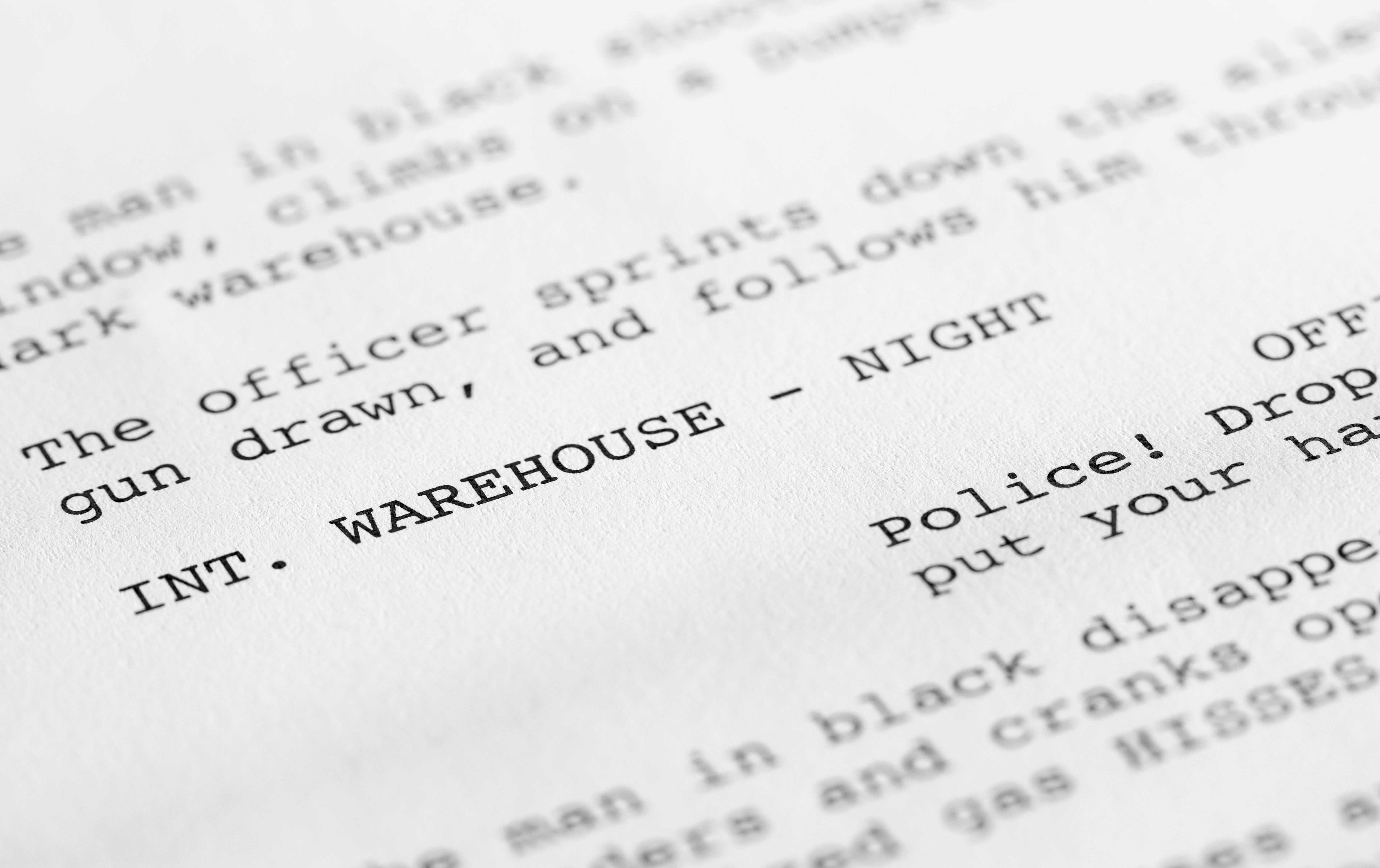
As I wrote in that past article about making your script look professional, managers, agents and producers like to see "a lot of white on the page." This meaning no big blocks of text when you're describing a setting or on-screen action. The more you space out the text, the more of the white background will be visible (hence the above phrase). In many ways, screenwriters should think of the white background of their screenplay document as a movie screen, and your words are the images projected onto the screen.
In addition to making the script an easier read, spacing out action is one of the simplest and most effective methods of cinematic formatting. I've had producers tell me, "Think of each line as a single camera shot." And aren't the most effective camera shots, the ones that focus on a single person, thing or action? Not only is it directing without directing, spacing out action is storyboarding without storyboarding; it's laying out the rhythm and pacing of the action, and in doing so, makes the reader envision it more clearly.
Cliffhanger Ellipsis & Dashes
Not only is it more cinematic to space out your action, you can go even further and create some cliffhanger excitement via ellipsis and dashes. Ellipsis are a series of dots that follow a sentence (…) and they serve various grammatical functions; usually they're used to indicate an omission of a word or sentence from a larger section of text. In screenwriting, however, I've seen them used as a visual break in action:
She keeps walking until finally reaching…
The HOUSE.
Ellipsis create anticipation for the next line, telling the reader there is more to come. A variation of this involves dashes, which I like to use if you want to convey something happening more abruptly in the below line:
She keeps walking until suddenly —
A FIGURE EMERGES from the darkness.
This would work well if you're writing a "jump scare" in a horror or thriller. However, like with any formatting irregularities, this shouldn’t be overdone. But if done at a few key moments of your script, it can be effective and highly cinematic.
ALL CAPS For Emphasis
You might've noticed that in those two above examples, I used ALL CAPS for the words "HOUSE" and "FIGURE EMERGES". This is another formatting technique that's commonly done by screenwriters today, which likewise makes for a more cinematic reading. Think of it as the camera focusing on an object or action (but without writing about a camera and what it’s technically doing). This is a prime example of directing without directing.
By using ALL CAPS for something you want to bring attention to, you’re helping the reader to know what to focus on. Also when primary characters are introduced, their names should be in ALL CAPS in the description (but only for their introduction). Like with the previous tip, this shouldn't be overdone; if you use ALL CAPS too often, it'll defeat its purpose.
Work Your Toolbar
I myself like to use the Final Draft Toolbar (which is designed to provide one-click access to frequently used commands). For example, I have font commands like Bold, Italic, and Underline in my toolbar, so if I need to place emphasis on a certain word or sentence, I can do so quickly and instinctively. For the same reason, I also have the tOGGLE cASE command in my toolbar, which automatically adds or removes capitalization to text.
Like with the above tips, this should be done in moderation, but if you want to create a little variation in your text for cinematic purposes, work your toolbar!
You need to customize it to get all the commands you want, but this is pretty simple. Go to View > Customize Toolbar. This will open the Customize Toolbar window. Dragging the command icons from the Customize Toolbar window to the Toolbar will add them (and dragging them from the Toolbar into the Customize Toolbar window will remove them).
The good thing about having these commands at your fingertips is you won't waste any time or creative energy when formatting your script to be more cinematic.
Ultimately it's about your story and characters.
But if you can also make your script read cinematically, why not use every tool at your disposal?
Written by: Edwin Cannistraci
Edwin Cannistraci is a professional screenwriter. His comedy specs PIERRE PIERRE and O’GUNN both sold with more than one A-list actor and director attached. In addition, he’s successfully pitched feature scripts, TV pilots and has landed various assignment jobs for Universal, Warner Bros, Paramount and Disney.- Topics:
- Screenwriting & Craft


